Dynamic Images Block

version 1.0

last updated 09/02/2016

Requirements: Concrete5 version 5.7.5.1 (or newer)

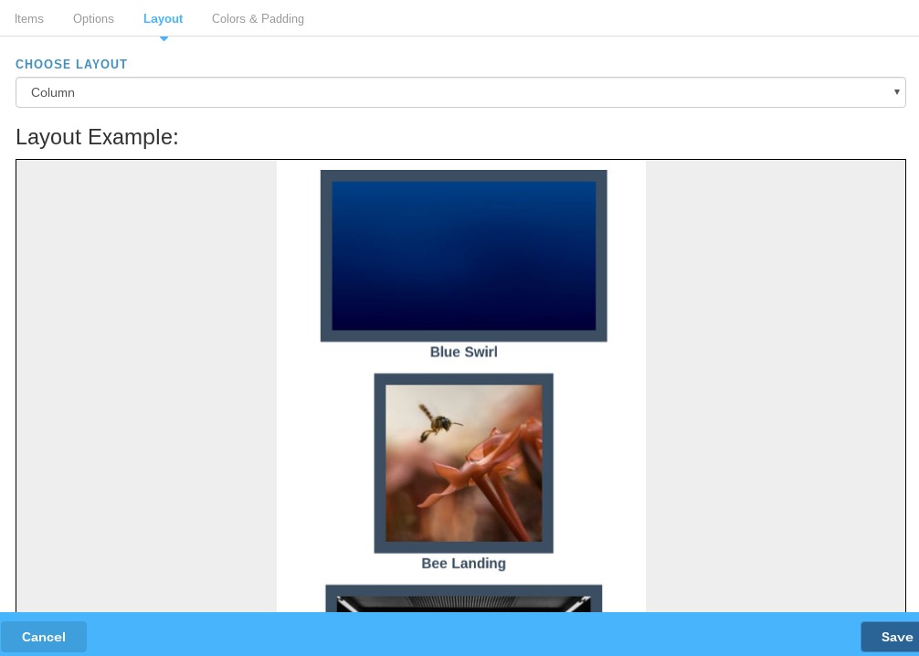
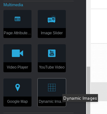
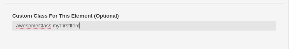
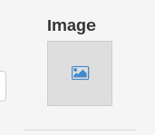
'Dynamic Images' for Concrete5 is a repeatable elements block that allows you to add however many amount of images to one block, and then select how you would like them to be displayed. This is useful for displaying multiple images in a grid or row layout.

Introduction

Upon the initial installation, you will find the Dynamic Images block added the the multimedia block section of your website.

How To Use This Block

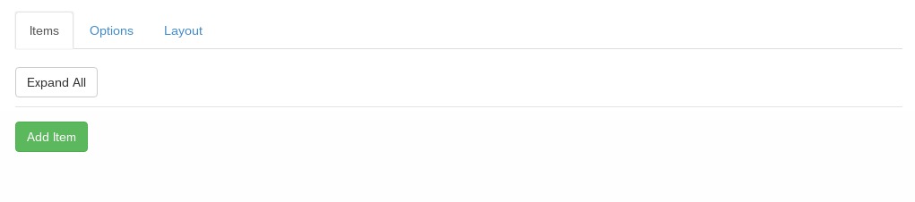
After adding this block to a page, you will be presented with the blocks form where you may:

  • Add, delete, and rearrange items.
  • Add custom classes to each item in the block directly.
  • Set global options, such as image cropping or custom classes for the entire block, as well as disabling or enabling displaying a title under the image.
  • Select a prebuilt layout to display your items, such as row or column.
  • Customize the background color and padding being applied to each image.

Adding, deleting and rearranging items

To add items to the block, click on the green 'Add Item' button on the left side of the form.

Your blocks first dynamic item will then be added the the form, like so:

Each item you add to the block gets a title where it displays its current item number based on its position in the list of items you add, and the name of the item itself it you happen to give it a title, like so:

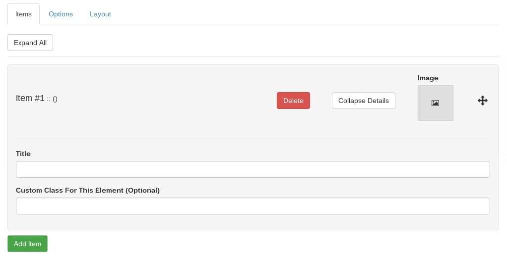
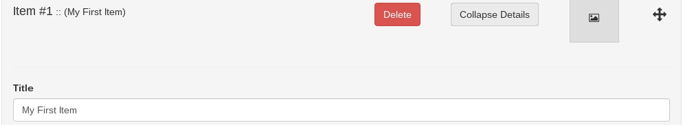
The titles only update once you've saved the block, but the item # will update automatically whenever you rearrange items.

After you have added more than one item you may rearrange them by clicking on the arrow icon on the right and dragging the item up or down.

To remove an item, simply click the red delete button on the item.

Adding custom classes to individual items

To add a class on individual items in the block, simply supply the class or class names you want applied to that item within the custom class field on the item. If supplying multiple class names, simply seperate the class names with a space.

Adding Images

To select an image, click the image icon next to the 'Collapse Details' button.

Select your image from the file manager and it will appear in the form.

Global Options

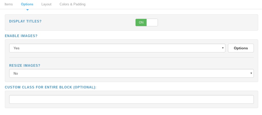
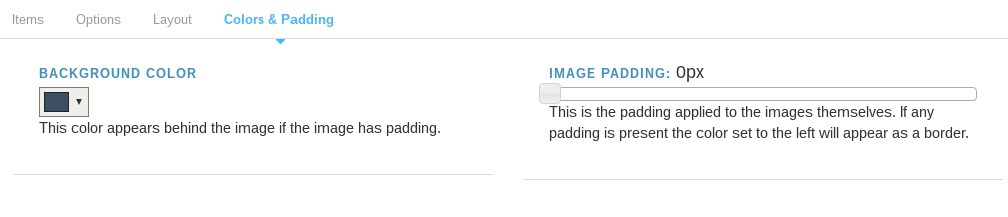
The edit block form has tabs at the top. The first tab is for the blocks content, which we just covered. Next is the 'Options' tab. From here you can do a variety of things such as:

  • Enable or disable the title. This won't remove the title field from the form, but it will remove it from the view for when the block is loaded on a page.
  • Enable or disable images. Not that you would want to disable images as thats what the block is mainly for, but you may do so if you please.
  • Resize and crop images. When images are enable the image options appear beneath. You may enable resizing and cropping the images in the block. This will resize and crop all the images contained within the block.
  • Custom class for entire block Supplying a class or class names here will apply the class name to the entire block element. If more than one class is entered seperate them with spaces.

Layout Options

The layout tab is where you can select a pre-built layout for when the block is loaded on a page. A preview of how this looks will be displayed below the layout selection in the form.

Customizing colors and padding

You may convieniently edit the background color and padding that gets applied to each image, using the controls on the Colors & Padding tab:

To adjust the padding, use the slider on the right:

To change the background color, use the color picker on the left. Make sure you click 'Choose' after selecting the color.