Introduction

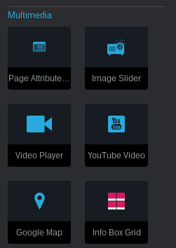
Once installed the 'Info Box Grid' add-on will appear under the Multimedia section whenever you're adding new blocks to your website. After you've dragged it into an area, you'll be presented with the editing form. The two tabs at the top are for:
1.) Adding new info boxes,
2.) Changing the style & layout the grid.
Adding Info Boxes to the Grid
To begin, click "Add Info Box". A new box will appear where you can select an image, input a title, edit what content you want to show and even choose a link if you decide you want this info box to link somewhere. Everytime you click "Add Info Box", another box with these options will appear in the list. You can rearrange these items by using the arrows handle on the right to drag the box up or down. When your done adding info boxes, click save. Once you've published or saved the page you added the info box grid too, the info box grid will be displayed. Depending on how many info boxes you added will determine how much space each one takes up on the screen. The more info boxes you add the less space each one will take up until they reach the 'minimum width' setting, at which point they will begin wrapping below. This is why its called a grid. Whether you add one or 20 info boxes, they will fit nicely.
Once you've played around with adding info boxes, check out the 'Style & Layout' tab.
Styles & Layout
The Styles & Layout tab is where you can customize things like how many boxes fit on a row, colors used for the info boxes, the space between them and more. Let's get started!
The first 4 options are colors:
'Image Background Color' - This is the color of the info box picture area. If you have not chosen an image, then this color is what visitors will see.
'Info Area Background Color' - Below the image is the the info area, this is the background color for that area.
'Info Area Content Color' - This is the main color applied to the content in the info boxes, excluding the title.
'Title Color' - You guessed it, the color for the main title used in each info box.
Next up are the image options. The images are applied as background to the info box picture area. The following settings are for controlling how the image is displayed within those areas:
'Background Size' - Initial will not resize the image at all. Contain will make the image fit 100% of the width. Cover will make the image fill the entire picture area (suggested).
'Background Position' - How this effects the position will depend on the background size setting. Beyond that it the image will be positioned in the info area according to this setting.
'Background Repeat' - If the image is to small to fill the entire info window area, this setting will determine if the image tiles or not.
The next two settings are for alignment. There's two options:
'Content Alignment' - This is a vertical alignment of the content in the info area. When multiple info boxes are next to each other, the smaller ones automatically scale to the same height of the largest one. This setting controls how the content in the smaller info boxes is aligned in the stretched info area.
'Text Alignment' - Controls the text alignment of the title and content in the info area.
The next five sliders are for adjusting:
'Border Radius' - How much to round the corners of the info boxes.
'Image Height' - The height in pixels for the info window area.
'Info Box Minimum Width' - A very important setting! This determine the minimum width the info boxes must be, which determines how many will fit across the screen before wrapping to the next line. For example, if there is 1280 pixels of width for the info boxes, and you have 4 info boxes, if the minimum width is set to 400, then 3 info boxes will appear on the first row, while the forth will wrap below and take up 100% of the available width. Changing this allows you to create virtually any kind of layout you want, whether you want 2 going across or five.
'Space Between Info Boxes' - Another important setting. This is space between each info box. This is additional space used in each row, so if your 4 info boxes had a huge gap in between them, maybe only 2 would fit per row before wrapping to the next line.
'Title Size' - Font size for the main title in each info box.
The last two settings are in a league of their own:
'Ignore Grid Framework Container' - Some themes will not support this, and it will make no difference whether you enable it or not. For the ones that do (such as Elemental), enabling this will cause the info box grid to ignore the main container of the page and overflow all the way to the edge of the browser. It is for making the info box grid take up 100% width of the screen.
'Enable Animation' - When enabled, the info boxes will zoom into their position on the screen upon scrolling to them, or initial view. See the live example to preview this effect.


